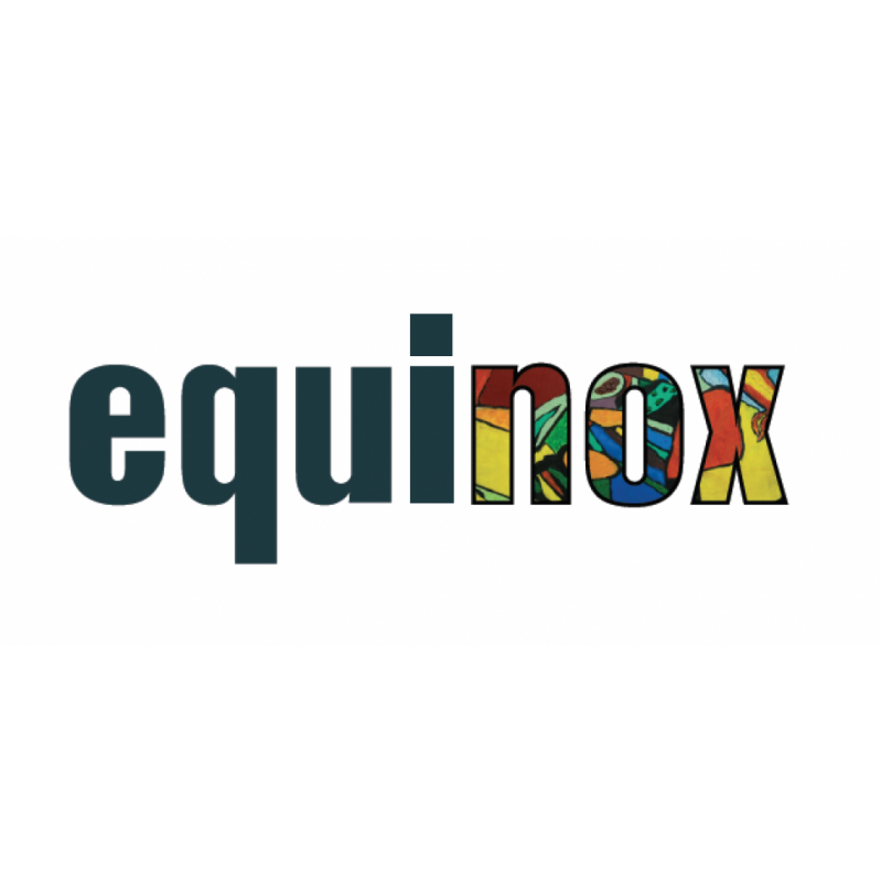

equinox brand, web & print: 3rd sector
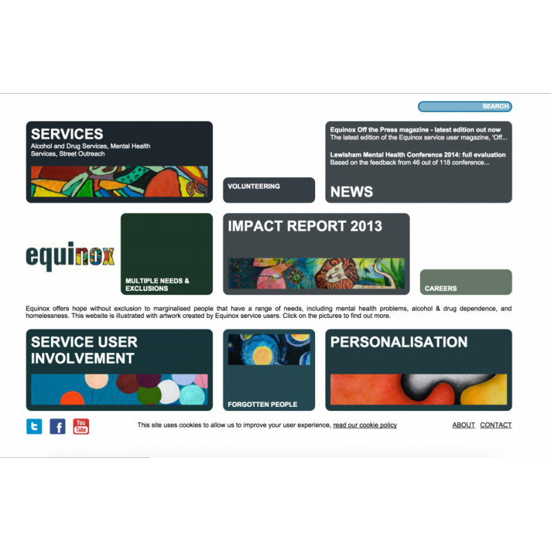
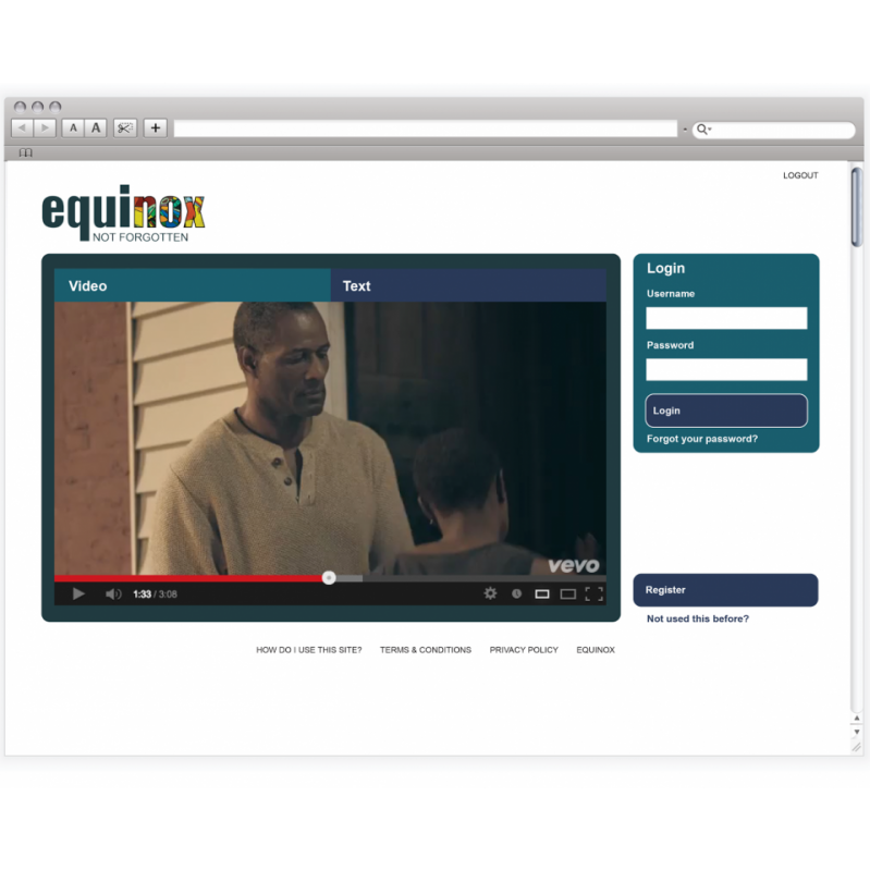
Service users have coined the term “forgotten people” to describe the section of the population that Equinox Care are providing support to, in their thousands, each year.
Equinox often sees people who, despite desperately needing assistance, are turned away time and time again because they do not fit the specification of local services. This leaves them feeling as if they are excluded from all hope and left out on the margins of the community.
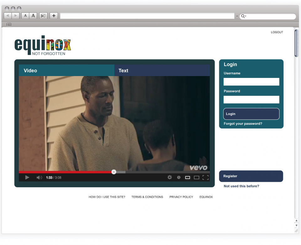
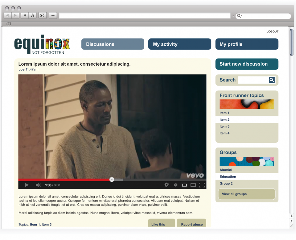
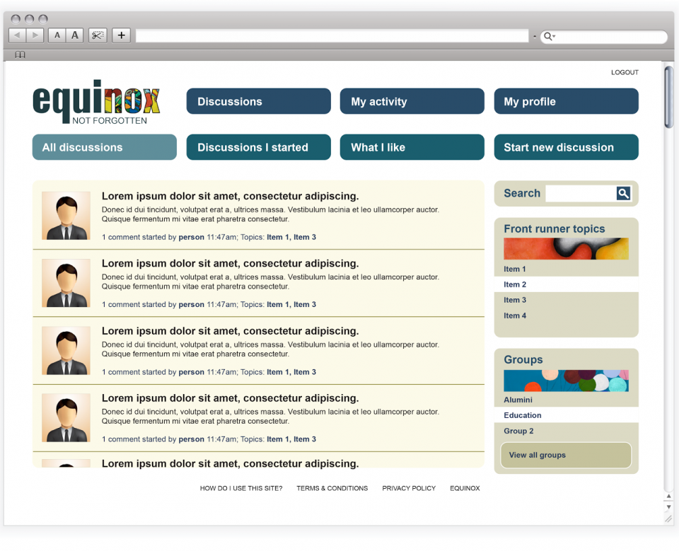
The brief was to create a new brand architecture to allow Equinox to compete in the increasingly competitive care sector and to then create a new look and feel for the brand to bringing freshness and dynamism.
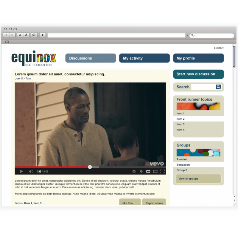
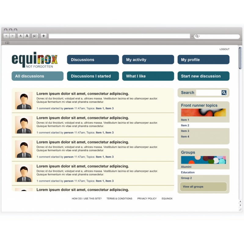
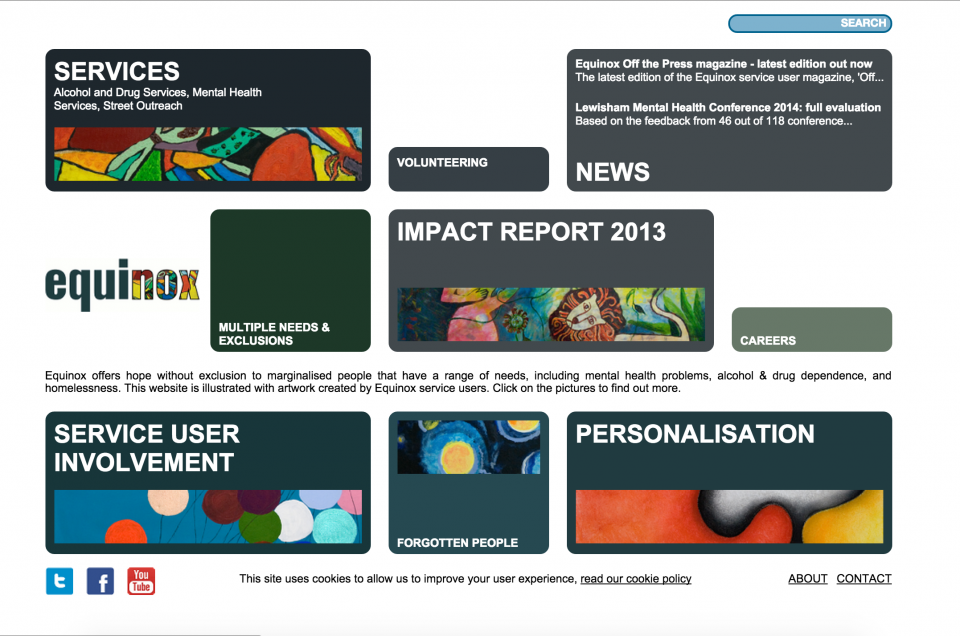
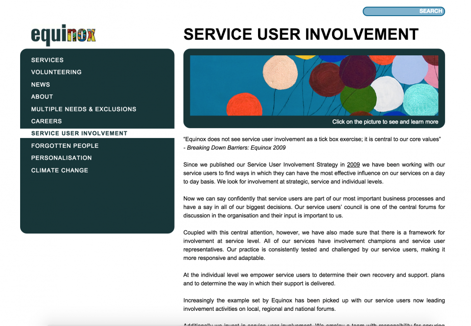
This new brand architecture was then manifested in a new logo, ID, website and in the creation of a closed social network for service users and care workers; the new ID was then rippled through all internal and external communications.
" Rodger and his team worked with me to develop a brand identity, design scheme and website for a charity that had a very low profile.
The results were excellent, with a consistent look and feel that fit the distinctive nature for he organisation perfectly.
The website was much admired and we were always happy to direct people to it as our “shop window”.
The process that we went through to get these results, guided by Rodger, was exacting, enjoyable and it enabled us to learn a great deal about our organisation.”
Bill Puddicombe
Former CEO Equinox Care, owner Hatch Consultancy